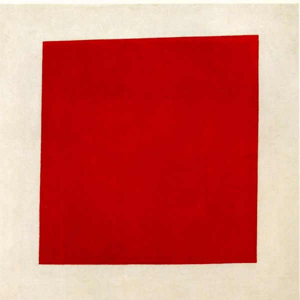
This painting—Red Square: Painterly Realism of a Peasant Woman in Two Dimensions by Kazimir Malevich—is the inspiration for my logo, as you see above. “Why?” you may ask.
Because I was in a Russian art museum, saw this across the hall, and laughed.
I came up closer to it, and saw that it’s title was Red Square. “Dad,” I chuckled, “it’s not really a square! That’s so good!”
It was like a private joke between me and the artist. Turns out that Malevich was dead serious about his Suprematist art philosophy, so if he had been standing there watching me, he would have been deeply offended by my mirth.
But that moment, and the painting that sparked it, has always stuck with me. There was something so laughable about the important piece of art, importantly titled, and inherently self-contradictory. To me, it’s a symbol of the good joke that art can be… not a sleazy gag or a snide con, but a well-meaning, well-placed, smile-inducing something that hits you in just the right way.
People who work in art and design play all kinds of games in language, but really, isn’t what we do so much about just working on something until it’s the way we like it, and then stepping back, and waiting to see if other people smile?
The new logo (and the surrounding design) is a kind of small homage to that.
