One of my favorite places to view high-end graphic design and branding is iTunes Movie Trailers. Don’t judge. These posters and trailer pages have exactly one chance to make an impression, and they know it. You’ll find some original and quality stuff here, because these studios are spending millions and they want every penny to count.
That said, there’s also plenty of forgettable design that runs on the page. Action movies tend to look like action movies, and you can spot a rom-com or a buddy comedy a mile away. But a little while back, I mentioned that I was surprised by the art direction in the trailer for Snow White & the Huntsman, stating that it managed to promote something at really looked fresh.
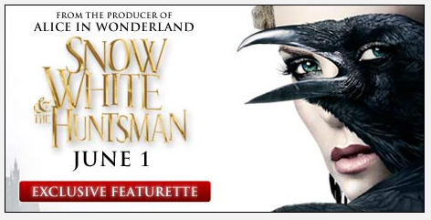
On that note, Snow managed to pull the same trick on me again today — pleasantly surprising me with something I hadn’t seen before. Take a look at the promotional image below. You can read it instantly (which makes it very commercial, not obscure or confusing), but the more you look at it, the more disturbing it becomes. Look at the eye on that crow. Raven. Whatever. That is not a bird eye.
 This is some good design. (Not to be confused with horrifying, nightmare-inducing bad human-eye-on-animal design of the past.) This is memorable, iconic, appealing, and disturbing.
Already inclined to be happy with them, I opened their trailer page, and was happy all over again. The stark black-and-white aesthetic continues, with an image that was designed with expert care for the iTunes preview page and no other location on earth. You just love to see this kind of craft go a piece of work.

Look how that owns the page. The trailer page demands a white top and a black content area … but this design takes that requirement and makes it classy, epic, and exciting. I think the key word here is restraint. Instead of filling the promotional images with a lineup of leads, explosions, magical creatures, or what-have-you, they’ve reduced their design to a stark, minimal, and memorable set of images that stand out head and shoulders on the page, while filling them with enough richness of detail to reward closer inspection.
To be clear, this isn’t an endorsement of this movie or any of its leads (none of whom are my favorites) … but it’s a ringing endorsement for the art direction choices made thus far. However the film pans out, this is one beautiful bit of fully-concepted and restrained design.