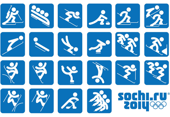
Let’s get two things straight: I love the Winter Olympics, and I love Russia.
But I also love good design, and Sochi.ru is already shooting itself in the face in that department with sophomoric typography, an out-of-touch grab at being “digital,” and now these cutesy-wutesy pictograms. Are these Cartoon Network characters supposed to represent the greatest athletes on earth exerting themselves to the limits of human strength and agility?
I very rarely “boo” any design, as any regular reader of this blog will know. I’m a big believer that nothing on earth is beyond redemption, and who knows? Maybe they’ll pull this out of its current nosedive with the same kind of visual goodness they’ve poured into the Russian Quilt design. I genuinely hope so.
For now, I’m sorry — but this is a face-plant.
Image & info via the always-amazing Brand New.

6 responses to “The 2014 Olympic Games are going to be a (visual) disaster”
Even though the Winter Olympics is really just “50 different ways of SLIDING”?
Ha — yes. One of the best lines of the night, but still.
Dadda, I saw your picture when Mom was commenting and said “DahDA!!” and blew you some kisses.
Best. Comment. Ever. In the history of the world. Love you both so much!
Not sure how much time to would take, but what would you offer as alternative ideas for the overall logo and individual icons?
Mike, although I can’t sketch up comps right now, there’s so much rich visual history in Russia to draw from. In its collision of east and west, it’s always been a culture steeped in iconography; so this default “computer-y” thing doesn’t work for me at all. They could have chased any number of looks — Orthodox icons, Kandinsky, Russian Constructivism, or a postmodern mashup of all three.
Beijing 2008 stands out in my mind as a proud and visible cultural identity that Sochi could have taken a cue from. Because if a city & country are going to host a game, they should be playing host, and welcoming you into their culture … not merely opening the door and holding up a computer screen.